UX design and research
Yarra Valley Water self-service

Evaluate the current experience of using the self-sevice portal.
Understand the customer value proposition of YVW.
Evaluate design prototypes against the value proposition (jobs to be done).
Customer value proposition.
User stories / jobs to be done / user requirements.
Establish Design principles.
Wireframes and User-tested digital prototype.
I was the Lead UX Designer throughout the project. This included planning and requirements gathering, strategic direction, wireframing, user testing interviews, UI direction and now involved with final delivery.
UX involvement: Desktop review, Heuristic evaluation, Landscape review, Card sort, First click test, User testing.

Sample: WAVE survey April 2019 - February 2020, YVW self-service report 2018, BI YVOW dashboard, YVOW Master Stats spreadsheet.
Output: Current state understanding of YVOW.

Sample: 4 hardship customers, 1 lived experience of domestic violence, 1 property manager, 3 commercial customers, 13 residential customers
Output: Customer value proposition (CVP) for self-service.

Sample: 3 usability experts unfamiliar with YVOW
Output: Benchmark of current best practice in digital self-service.

Sample: AGL, ANZ, Momentum, Origin Powershop, Suncorp, Simply energy, Fitbit, Mercury responsive, Up banking
Output: Critical evaluation of YVOW’s current UX and UI design, against standard usability principles.

Sample: 131 YVOW customers
Output: Quantitative validation for claims made.

Sample: 3 commercial customers, 13 residential customers
Output: Prioritisation of key jobs to be done in self-service.

Sample: 19 YVW customers, 13 non-YVW customers from Optimal Workshop user pool
Output: Understanding users preferred information structure within YVOW to meet users' mental model
of how self-service should be organised.
We did this to also understand how the jobs and tasks should be grouped together to help users navigate the self-service portal.
The grouping of jobs to be done informed the menu system for user testing sessions.

Sample: 22 random participants from Optimal Workshop user pool
Output: User feedback to inform design of self-service prototypes.
20 questions asking users about the functional design elements they prefer and why. Follow up questions to understand their selection.
The preferred designs were used to inform functional elements of prototypes used during user testing.
E.g. Graph options and displays, log in options, the right amount of information on tiles.

Sample: 10 users recruited through Askable, mix of YVW and non-YVW customers
Output: Iterative improvements on future state self-service prototype.
We wanted to test if users understood how the system works, what it does and how they interact with it. This was done with an
interactive prototype where users were presented with scenarios and tasks to complete. Two rounds of usability testing were completed.
Validated UX design grounded in user testing and feedback was the result.
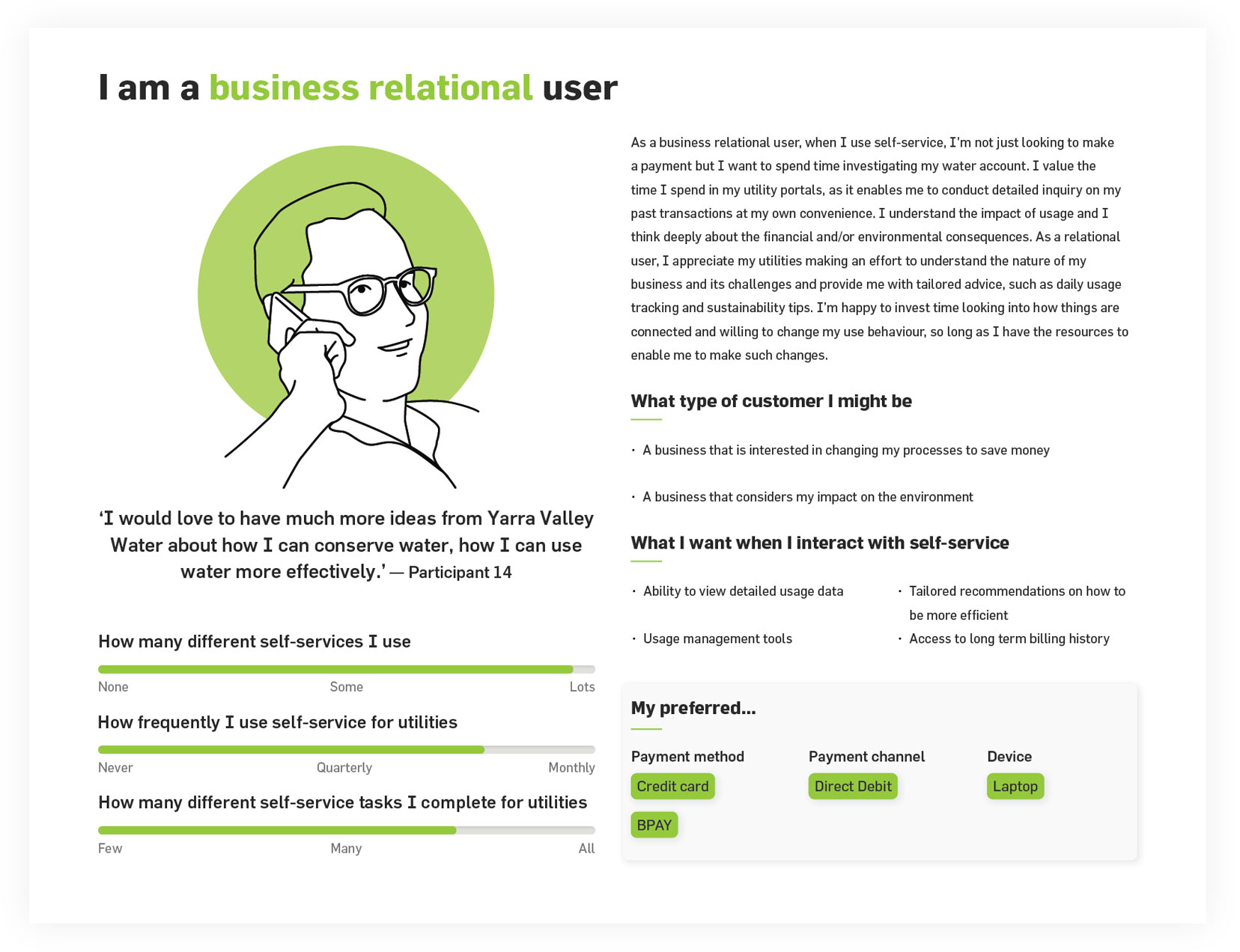
Customer Value Proposition
The Customer Value Proposition (CVP) represents the value customers expect from their experience
using self-service. The CVP that emerged points to users wanting more than basic self-service,
so that they can value add to their interaction to achieve nuanced functionality or create a deeper relationship.
The CVP comprises six elements affecting experience that when made material through UX design,
have the scope for each archetype to tailor its self-service experience. People nominated their hierarchy of jobs to be done via self-service.
These were subsequently prioritised by their potential to influence customer satisfaction. People expect that our
digital self-service will make primary billing, account management, and the kinds of usage tasks that digital metering can inform.
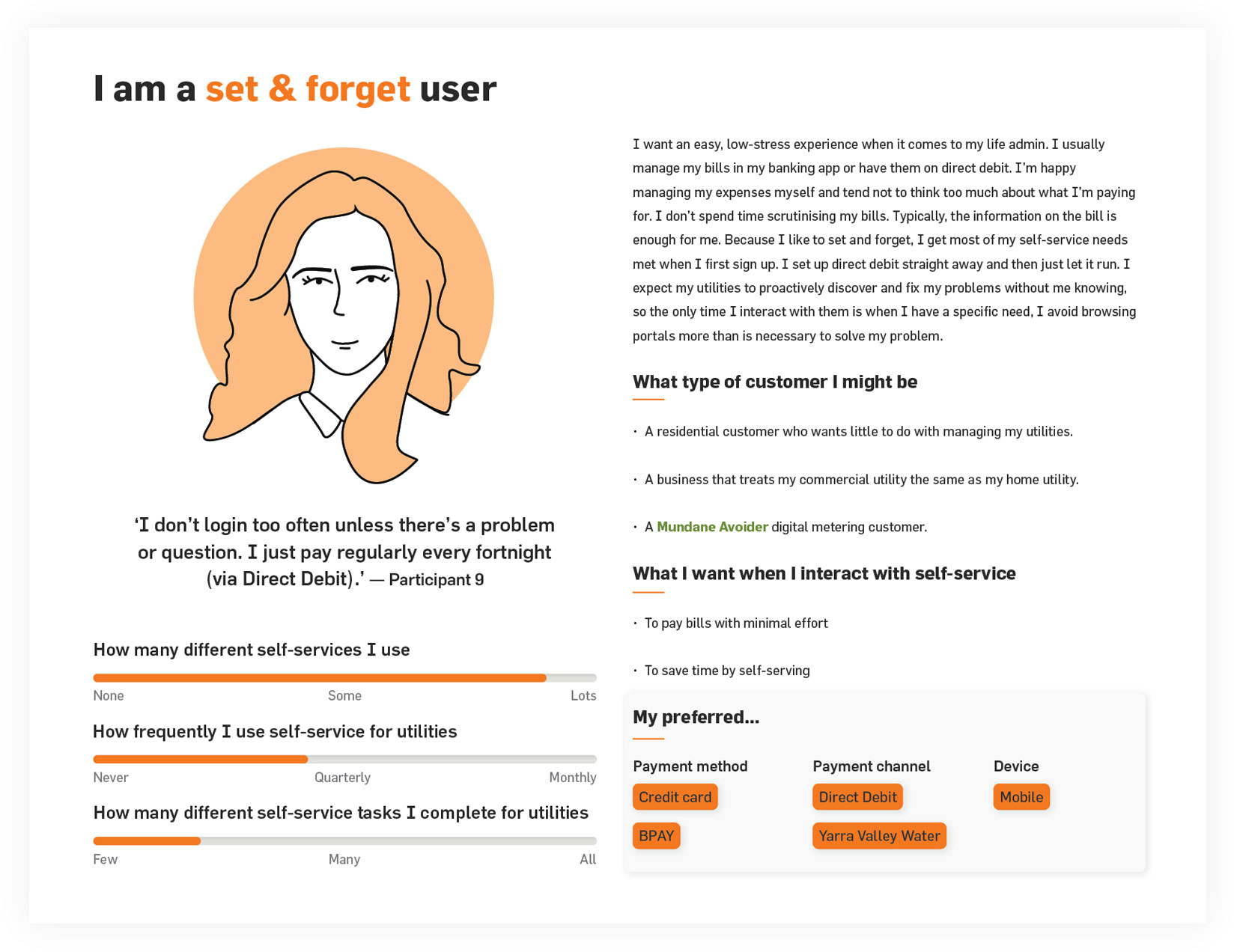
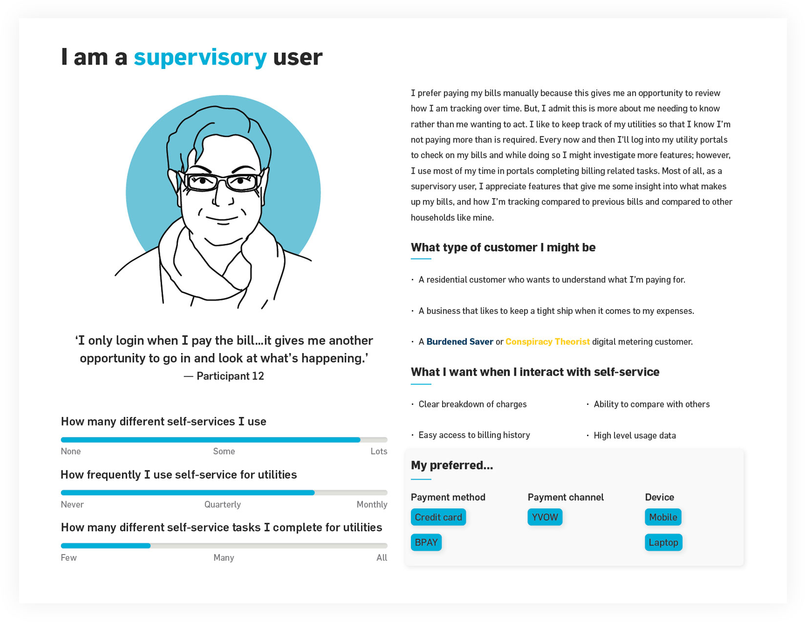
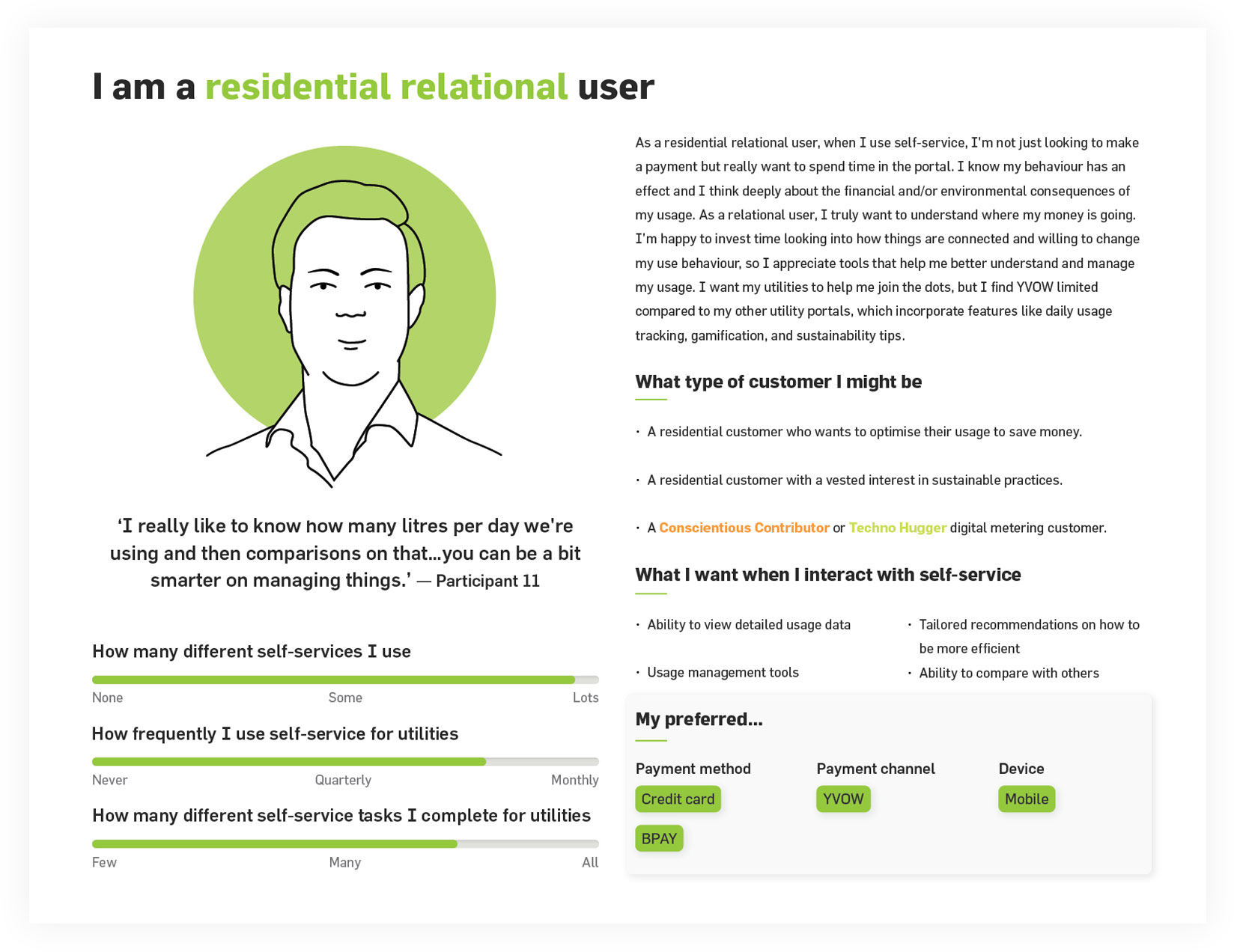
Three self-service behavioural archetypes emerged; set and forget users,
supervisory users and relational users. The distinctions represent the expectation
that self-service will cater to different levels of engagement and self-service functionality.
Some digital metering personas are evident in the YVOW archetype set, reinforcing the idea that there may
be little difference between YVOW, digital metering and the idea of a self-service portal.
Current usability does not meet basic best practice. The heuristic evaluation highlights significant under performance in usability,
resulting in a portal that is inferior compared with other digital self-service experiences that users access.
Lead the user to successful achievement of goals.
Follow the user’s progress and provide support as needed.
Get out of the way to allow the user to perform tasks efficiently and effectively.
Conformity was determined by whether or not the portal adhered to the six usability criteria of each principle.
Current portal failed to address 11 out of 18 usability criteria that comprise the principles,
showing the portal's non-adherence to basic usability standards
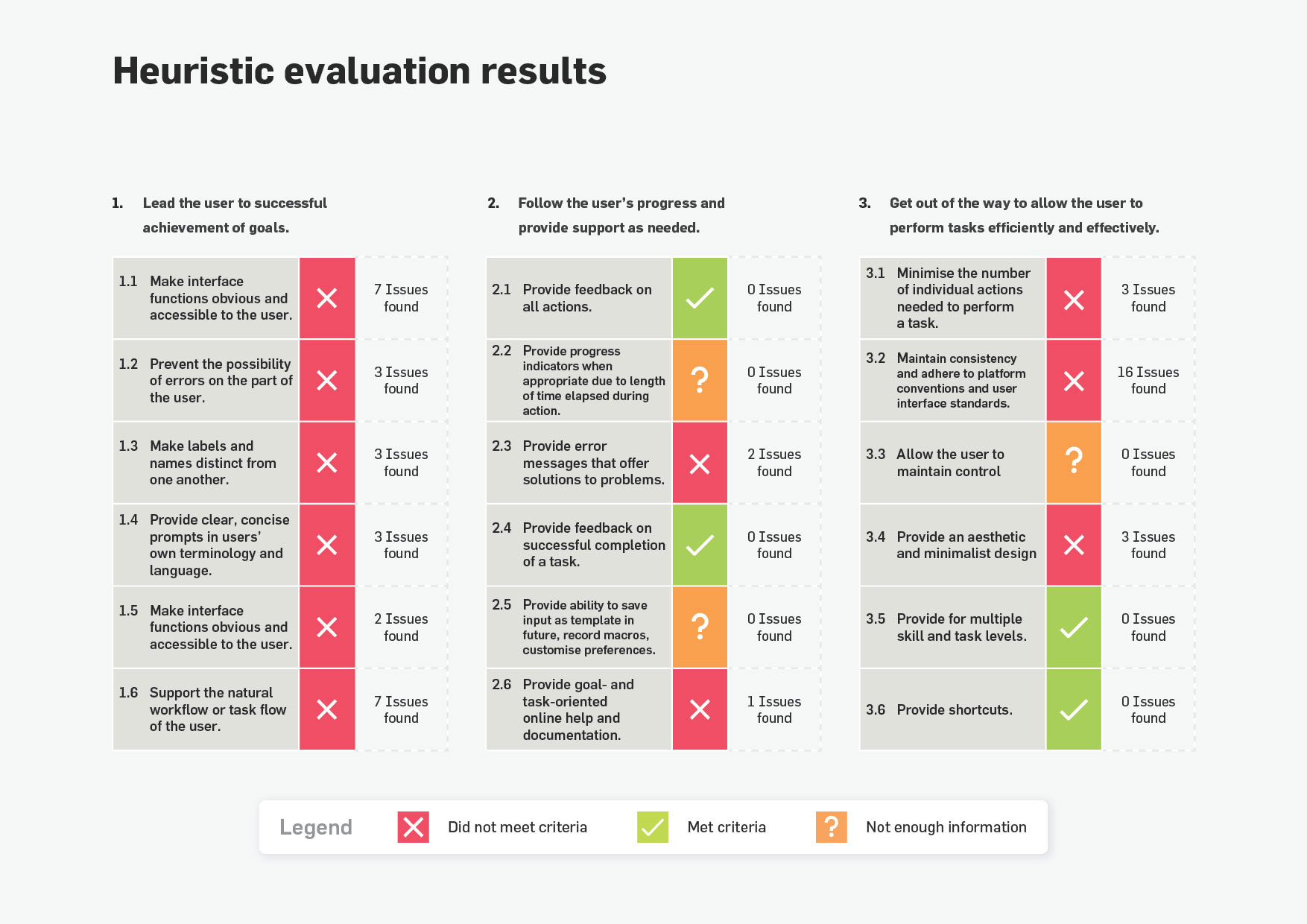
A landscape review based on the results of the heuristic evaluation was completed.
The usability was compared with other digital self-service where usability principles were applied successfully.


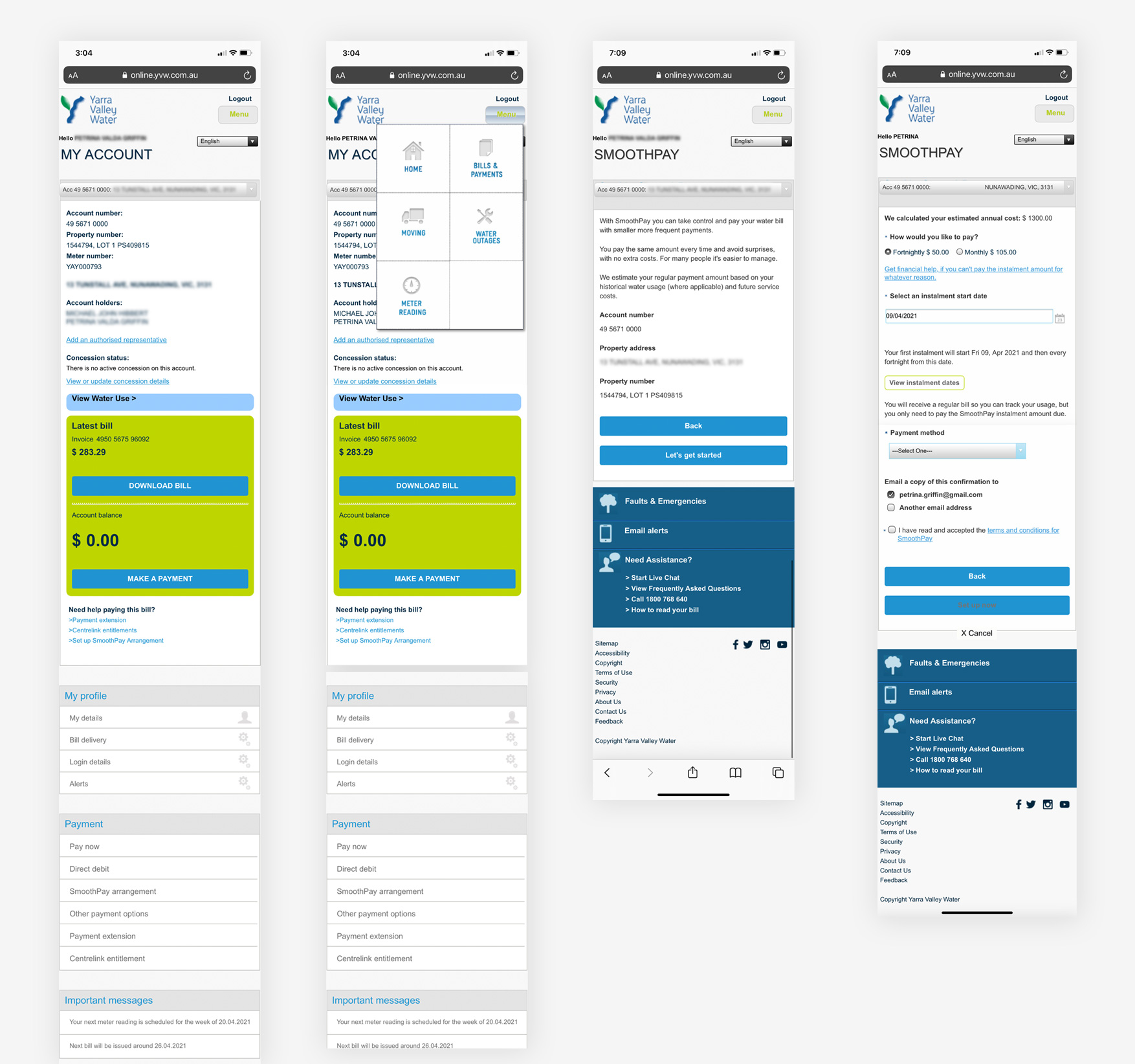
YVOW in it's current state. Dashboard, menu drop down (or pop out) and Smoothpay screens
How we addressed our users deeply held values
Being able to view and manage details on my water account(s).
Being able to clearly understand what I’m paying for in each bill and over time.

Having access to features that help me manage my water usage (e.g. water saving advice, goal setting). Being able to compare my water usage to others

The purpose of this research was to gather feedback on mid-fidelity wireframes for Self-service. Research findings, key jobs to be done and landscape review informed initial designs and concepts. Task based usability testing via video call, users shared their screen so we had the ability to see their face and watch how they interacted with the prototype. We looked at what they did and asked them to talk through why they did it.
Using the Jobs To Be Done framework helped develop design concepts once they had been identified. The step-by-step process helped me break down the challenge into smaller problems that I could solve one at a time.
Usability testing was conducted with 10 participants across 2 rounds of testing, 1.5 weeks apart (with 5 participants each round) to inform and test design iterations. Interviews were one hour long, moderated remote face-to-face.
Week commencing May 29, 2020 participants included: 2 men, 3 woman, aged between 25 and 46. A mixture of Yarra Valley Water customers. They were from varying cultural backgrounds and represented a range of technological preferences and familiarity.

Week commencing June 15, 2020 participants included: 4 women, 1 man, aged between 27 and 62. A mixture of Yarra Valley Water customers. They were from varying cultural backgrounds and represented a range of technological preferences and familiarity.

We put together a range of components including different usage displays, billing tiles, account details etc.
We asked users to put together their ideal dashboard with the information they found most useful and in the order they preferred.
Dashboards built by participants below
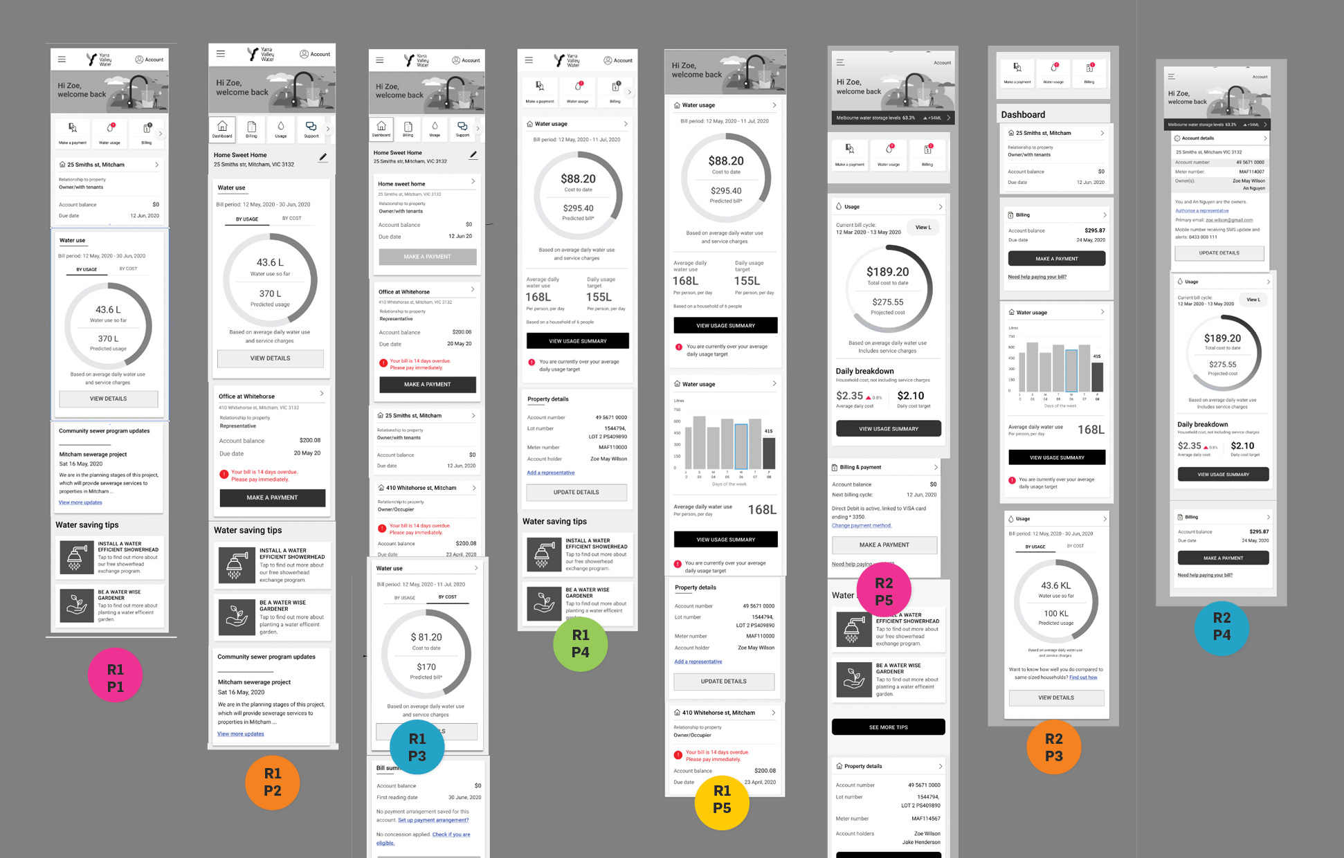
Tested multiple scenarios with users.
Developed user flows for different JTBD and features.
Tested if users could complete tasks and gathered feedback along the way.
Scenario
As a customer, I would like a quick overview and summary of all my properties to make sure everything is on track and to check if any action is required.
Zoe has multiple properties with Yarra Valley Water. She lives in one (owner occupier), rents 3 and is an authorised representative for a family member
Questions
How much information is the right amount of information on each property tile?
What actions do you expect to be able to do from this page?
What would you expect this page to be called?
Would you like to label the tiles yourself?
Discovery
Multi property dashboard
• Overview - most popular name when a customer has multiple properties
• Address as the identifier for each tile (no requirement to them the ability to personalise)
The right amount of information:
• Relationship to property
• Account balance
• Due date
• Payment method - lets me know if it's autmatically taken care of (e.g. direct debit)
Single dashboard (once they drilled down)
• Dashboard shows real time usage and costs with projected cost. Ideal for managing finances.
• Shows how customers are tracking with the goals they set with the ability to make adjustments. CTAs were clear when asked to make changes.
• Quicklinks were popular for both identifying any urgent action required and as a quick navigation method for popular jobs.
• Dashboard was great for "skimmers" with the ability to drill down to further detail (for relational, detail orientated users) was well received.
• Preference for tile default to be in Litres and Dollars was split
(the ability to toggle between the two is an option they liked)

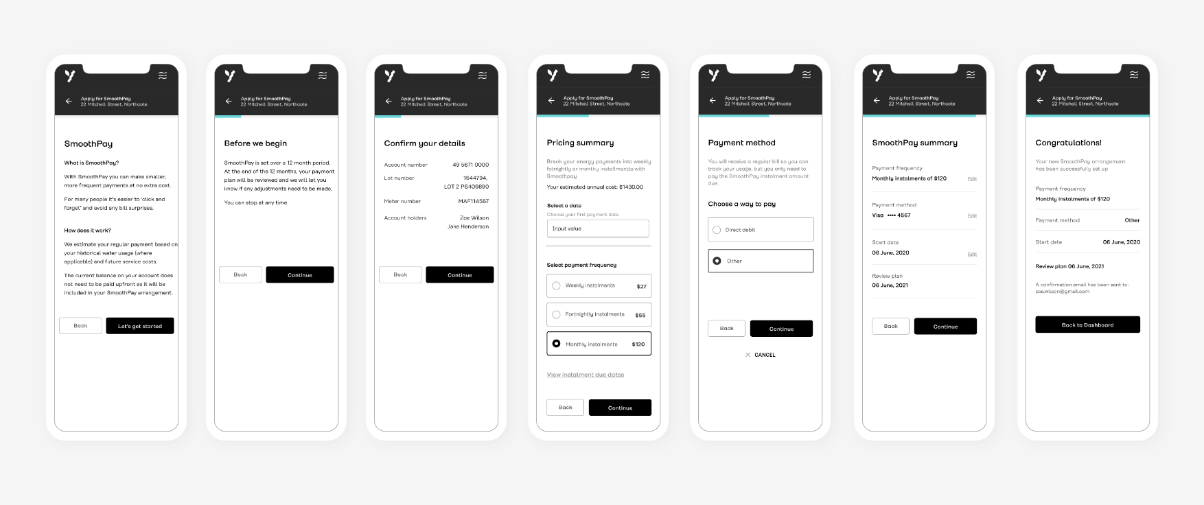
Scenario
As a customer you would like to avoid a large bill every 3 months.
How would you go about setting up regular payments to avoid this?
Discovery
Found the the process of setting up SmoothPay to be quite simple
Understood it was a quick process due to the status bar
Liked the payment summary
Liked the confirmation screen, it is something they would expect as well as an email
Users took a moment to understand the term "Smoothpay" and what it meant
Scenario
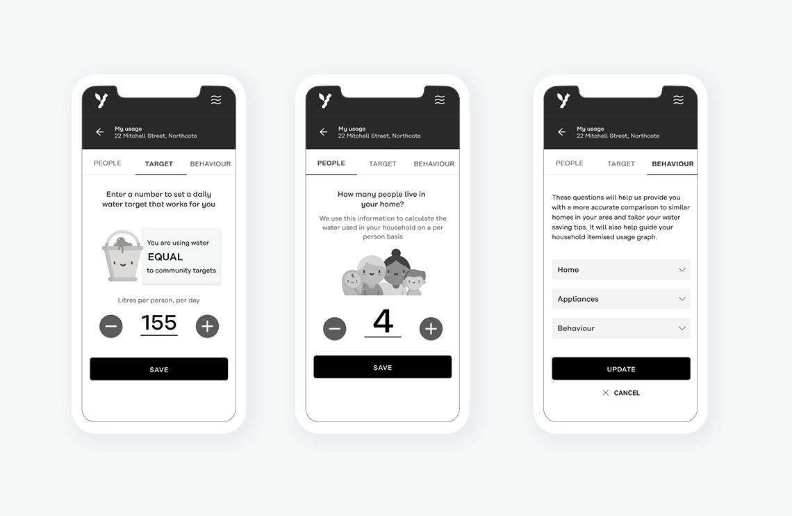
As a customer you would like to add another person to your household to manage your target realistically.
Discovery
For users who like a lot of detail, this is exactly what they expected to see, including hourly usage and comparisons (relatational users).
The option to toggle between usage in Litres and usage in Dollars was very well received and easily found. Default would be
to not have the service charges breakdown showing but the option to be there for easy consideration with access to more detailed information.
The breakdown list by month at the bottom of the screen was also well received, a quick comparison view.
Users who felt comfortable with their water use weren’t overly interested in comparisons with neighbours, customers who weren’t quite sure but keen
to do better were interested in this feature. Recommendation, this wouldn’t be the default setting, have these options be clickable.
Users found it easy to update their settings from this page.
The word Behaviour had mixed responses. Most users understood what would be under the tab but didn’t like the word. Recommendation is for us to change this.
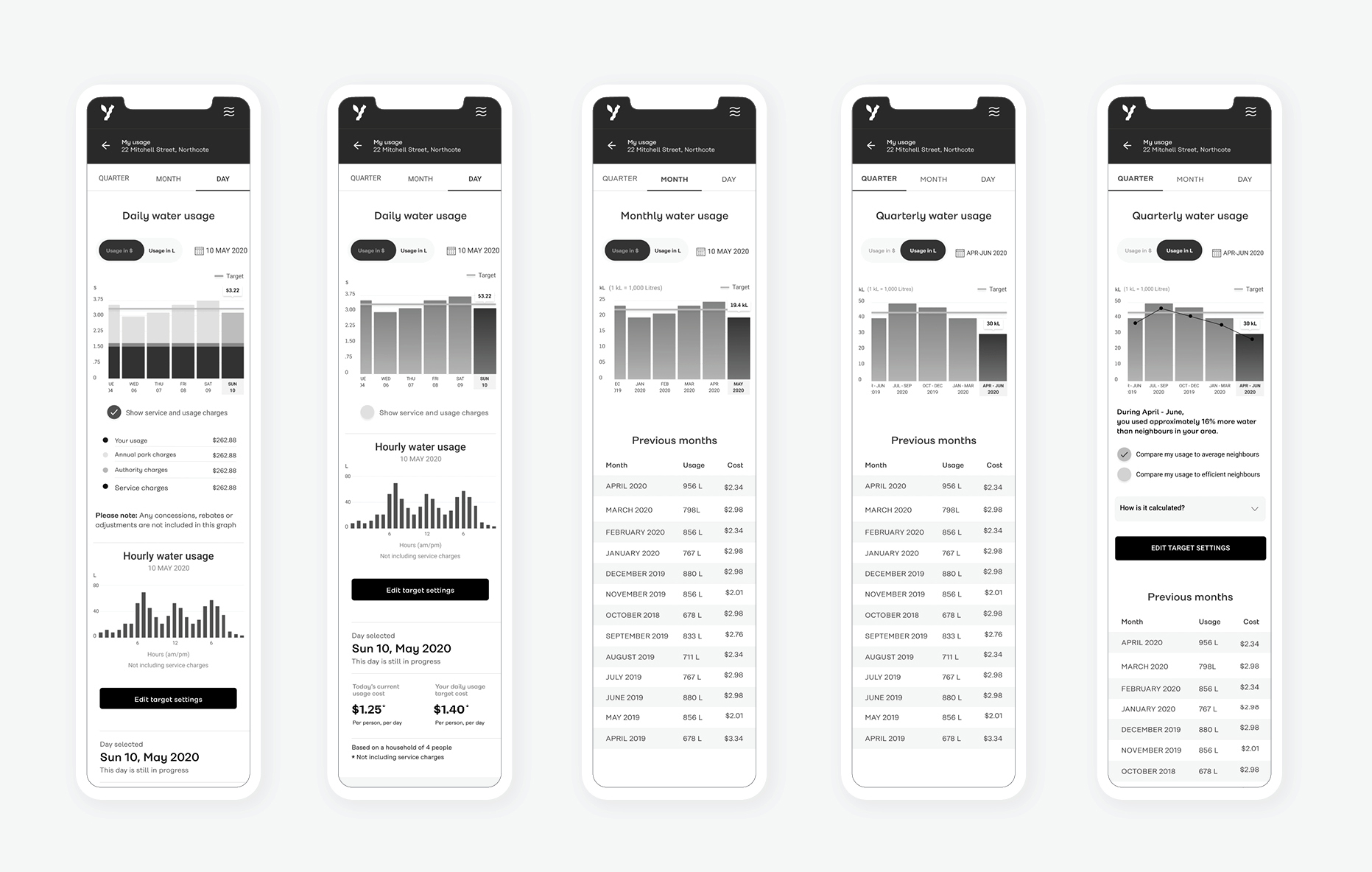
The word Behaviour had mixed responses. Most users understood what would be
under the tab but didn’t like the word. Recommendation is for us to change this.