UX design and research
Yarra Valley Water corporate website uplift
Customers are affected by poor website usability, namely information architecture and content strategy.
This has an impact on customers’ ability to complete jobs-to-be-done, locate online resources, access and
report urgent information, and engage with a streamlined service experience: as evidenced in the pre-discovery
research. This also has an adverse effect on key business priorities such as effective customer communication,
efficient emergency handling, accessible online self-service, and poses a reputational risk due to lack of inclusivity.
Improving the information architecture and content strategy of the website, we will see that it helps resolve
issues customers are facing, mitigate the risks to the business we have identified and optimise opportunities to
achieve customer value and satisfaction.
IA structured to customer’s mental models
Navigation streamlined to top tasks and information
IA that supports discovery of the website and portal features & content
Drive customers to self-service & management portals
Templates & components that support CMS workflow & servicing content
UX lead, managing 2 UX designers and 1 UI designer. Encouraging collaboration and distribution of tasks.
Also conducted research interviews, card sorts and Tree testing. Made sure everything was tracking to schedule and
keeping key stakeholders up to date with emergent findings
Existing research was reviewed, the results found further need for better:
Information Architecture - Customer centred, labelling, grouping, hierarchy and increased visibility of available content across the website
Navigation - Streamlined access to task completion and locating information.
Content - Structured to support the servicing needs of customers
Accessibility & usability - Solutions that are designed for specific customer groups and to accessibility standards
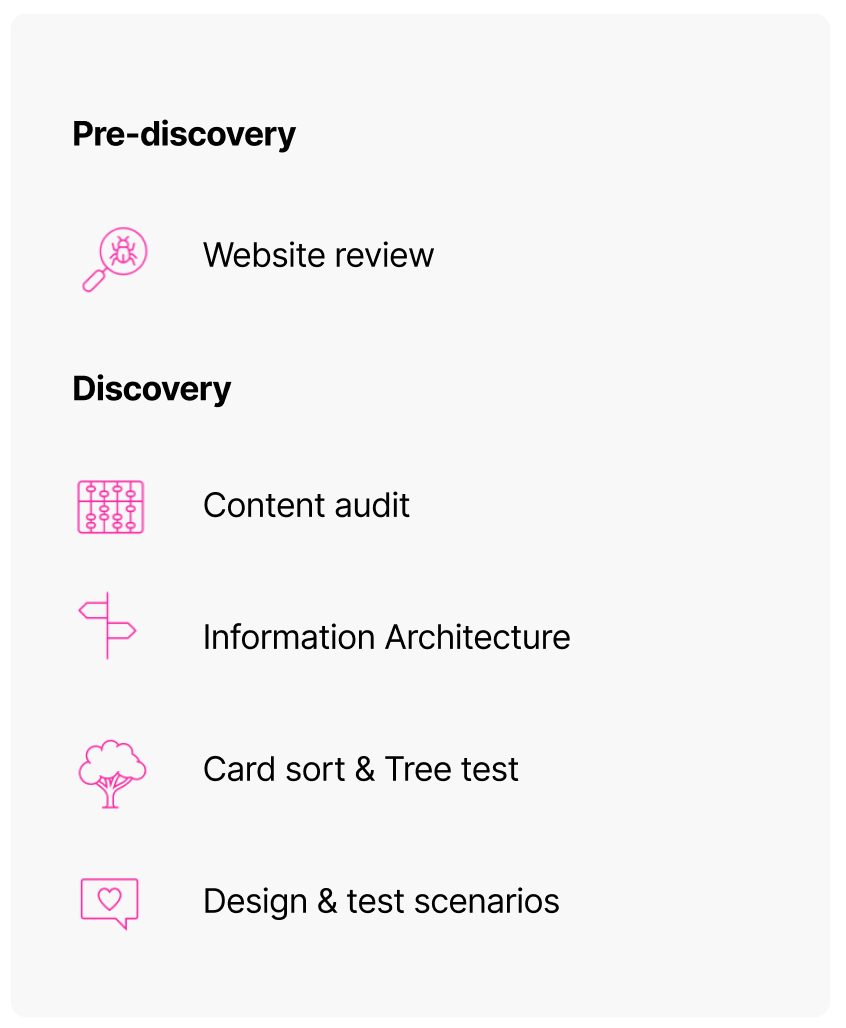
Solutions are then defined, tested and validated through the discovery phase
The YVW website does not currently have a clearly defined digital content strategy that supports servicing customers online. This creates opportunity to re-define the website as a servicing, brand and communications space. YVW’s poor content strategy is the result of the website’s outdated content framework. We have used this opportunity to re-design the website with the affordance to house a digital content strategy that supports content for the web, intuitive wayfinding and task completion that integrates UX design with writing to meet accessibility guidelines.
Pre-discovery uncovered three kinds of functions that website content needs to address.
Navigational – Home page, Landing pages and Global navigational components.
Functional – Content and pages that assists customers in completing tasks like ‘Pay a bill’ and information that supports task completion.
Communicative (CYVW Communications)– About US, Community, Educational content and Faults & Works.
As many website pages do not define any clear primary function, pages are often lacking in a clear structure and purpose.
During the content audit we assessed the effectiveness of each page in fulfilling one these functions as ‘Primary goals’.
Results
1. Completed an inventory of the website = 506 pages
2. Identified dead links and redundant pages = 52 Pages
3. Suggested pages to be consolidated or supported in FAQ - potentially 23 pages
4. Understood existing content groups and navigational structure
5. Defined and assessed existing content across three ‘Primary goals':
Navigational, Functional and YVW Communications.
6. Categorised content into user tasks as;
Account - Accounts & billing
Property - property & water services
Ren Build & Dev - Land development
General -Communications
Outcome
The audit has proven to be effective for further informing the IA that we now test with User groups across top jobs to be done.
1. There is an inconsistent approach to publishing content, structuring pages, using templates and components.
2. Where certain pages may be informative, they are not structured for web with language that may not be accessible to layman users.
3. Some content sections are heavily buried within the IA in cyclical navigation flows. Users may be unaware some content exists or still resort to using the search bar to locate it.
4. Often pages lack orientation indicators, breadcrumbs may be incorrect, titles are not clearly presented on parent pages. Content then lacks context and users can easily get lost or forget how to get back to a landing page.
5.The left side menus are often huge, lacking hierarchy or relevance and adding to the overwhelm of pages. These menus do not behave consistently across devices.
6.There is a need for CX to support content creators with a best practice guideline to publishing in the CRM.
Existing navigation links through multiple landing pages filled with links that could be confused with content components
These are text heavy with tiles formatted like FAQs and supporting text, there will often be
multiple links across a page or content section to the same page all with unique labelling and
no clear indication of the destination page

IA & navigation findings
Because many customers access the website only occasionally to complete specific tasks,
the IA must effectively communicate and support discovery of what the website and the portals
can offer customers at all the initial stages.
As we have sought to reduce landing pages and remove them from top tier navigation, we have become more dependent on in-page links to direct navigation to lower tier content.
Link components are structured to identify the tile of the destination page foremost in the link with room for contextual content where needed.
Pages are designed in one column wherever possible to assist simplicity, hierarchy and accessibility best practice for zoom screen users
Quick Link on the home page are the only exception where labelling is more action orientated and not exact to the corresponding page tile

Because many customers access the website only occasionally to complete specific tasks,
the IA must effectively communicate and support discovery of what the website and the portals
can offer customers at all the initial stages.
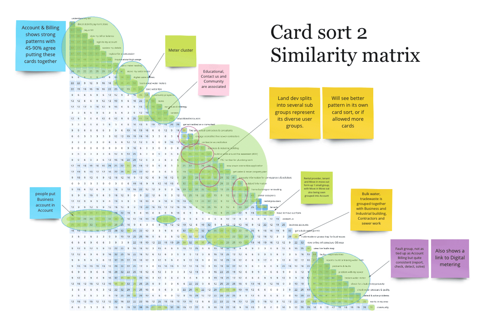
60 cards for jobs to be done
The card sorts informed the iterations on our initial assumptive IA, and the prototype designs in Figma.
Note colour
Blue - Accounts
Yellow - Land development
Purple - Faults
Green - Split
Pink – About us
This led to the following IA for further refinement through Tree testing the IA and User testing task based user flows.
Accounts
Faults and works
Building and plumbing
About Us
FAQ
Card sort similarity matrix 1
Removing landing pages from the first tier navigation to elevate top tasks and information within the IA in section menus.
Results in an increased visibility of content at an earlier stage in navigation.
Land development
This finding is especially applicable to land development and faults and works content.
Where content may be informative, it's not structured for web with IA, navigation and language accessible to layman users or in some instances, professionals as well.

Existing content for Land development on the current website has been burried in the IA
under Help & Advice/ Develop & build and lacks any direct navigational path to its buried l
anding page.
To make this content visible and more accessible we have pulled it out into its own s
ection in the main navigation menu, 'Building & Plumbing.'
This section has been particularly challenging to re-organise as there was no previous content strategy around it.
This content is primarily for- Plumbers, builders, architects etc who may hold a stronger technical understanding,
but must also be accessible to laymen customers like homeowners for building and renovating homes and businesses.

5 out of 6 users could locate the info quickly under Plumbing & Building. They said if they couldn't find it there, the second option.
Laymen strongly associated Building and Plumbing with their home reno, or any building work they're undertaking.
(In the tree test a third went to ‘Faults and Works’ initially’ associating 'Works' to home building and renovating.
We updated the menu to Faults an Infrastructure that has tested well.
Both Laymen and professionals expressed the need for an intro guide for laymen users to
understanding processes, applications and language they should be looking for in this section.
More information about what customers should pay for, so they don't get ripped off.
There is currently a lack of information around what applications will cost,
what steps are involved and how long they take. Laymen test participants expressed a need for this information in the planning stage of a project.

Often posed questions in the navigation are presented as link titles with answers simply
being a links to an information page or a link to a further FAQ page. With no indication of the destination page title contained in this link this creates a lot of confusion around navigation to content across the website.
Solution
The solution to this has been to house existing FAQ content in an actual FAQ section and organising
functional content better within the IA of these site sections.
Navigation across content pages into FAQ content has tested very well with participants
who would not usually gravitate to FAQ pages, easily able to locate the information they need there.
Generally, feedback was a certain level of surprise in viewing the design of this section
and that is seemed more helpful than they would have anticipated.
Some participants would go directly to the FAQ section when asked to find functional content
on a subject they were not familiar with.

Due to the FAQ content not specifically being designed for this structure in many cases,
there has been a level of flexibility incorporated into the navigation design here.
Some sections may have one simple page of FAQs, while other may provide links to further FAQ c
ontent within the selected topic,
meaning the breadcrumbs can run several layers deep within one FAQ section.
This has an advantage of being able to provide links in content pages directly to the relevant information.
The approach has tested well with participants not minding the inconsistency in UI but appreciating that they were able to find the information they were looking for.

Using the assumptive IA we asked customers to complete a range of
tasks so we could understand where they look for information,
forms and portals to complete tasks across the website.
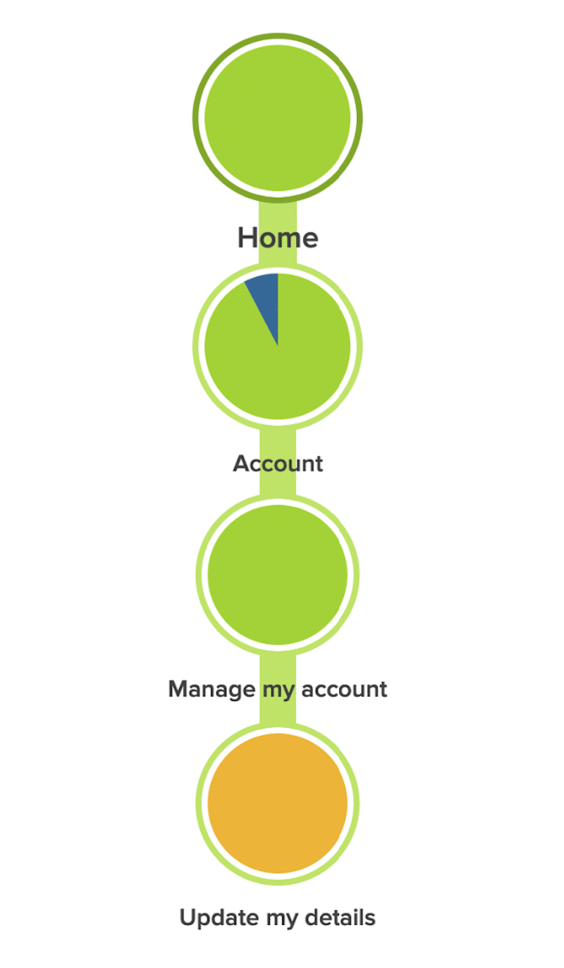
Scenario
Find out how to update your contact details online.
Here we can see the assumed path is very straight forward and intuitive to customers.
The strongest path taken under the following titles-
Account>
Manage my account>
Update my details
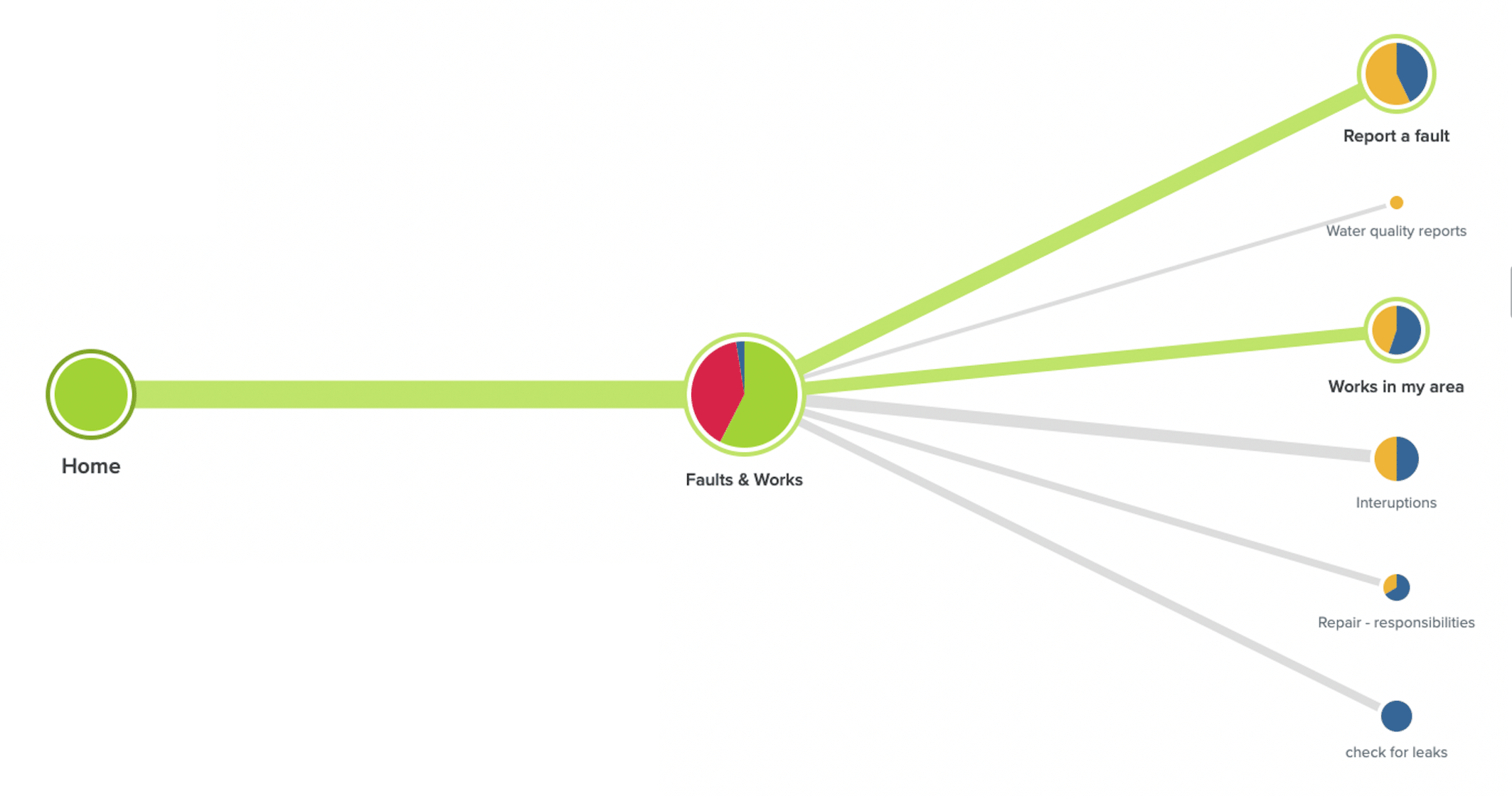
Scenario
Participants were able to navigate to the intended faults information very easily
Participants took under 10 seconds to complete these scenarios

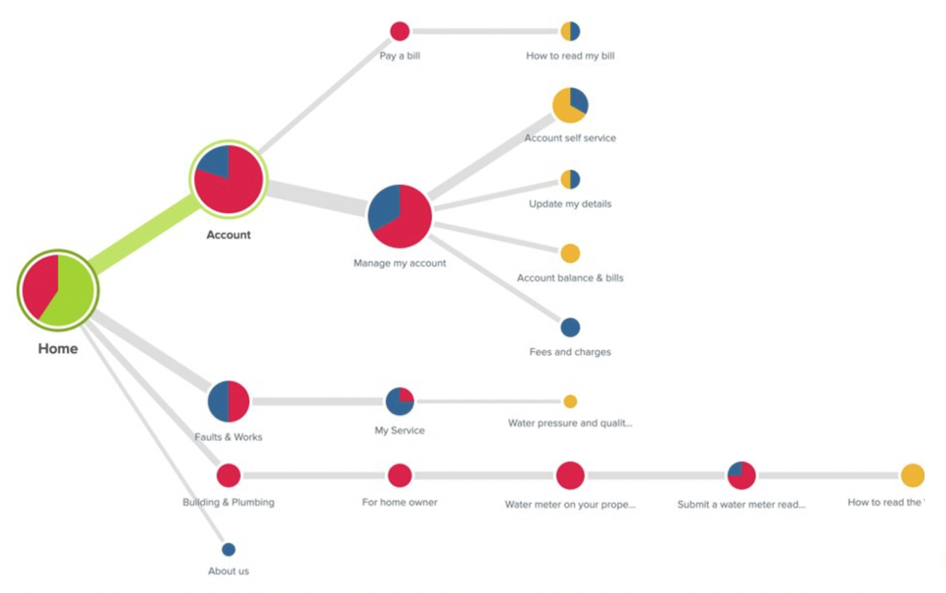
Scenario
You are on the website of a water company.
Find out how to submit a water meter reading for your home.
Here we can see the assumed path is split by customers who may look in a range of areas across the website for the same information.
The strongest path taken under the following titles-
80% looked under Account
66% then looked under Manage my account
The remaining 20% looked under faults and works, Building and Plumbing and About us.
Scenario
We gave participants several scenarios and asked them how they would approach the task.
Participants shared their screen and spoke about why they were making the decisions they did.
Summary
Tasks investigated in Round 1
Accounts and Billing, Faults, FAQ, Contact us and Search 5 participants and 1 internal Pilot test

All participants found the link easily in the Global Navigation
Both steps to Register a new account and log in were clear and as expected to participants
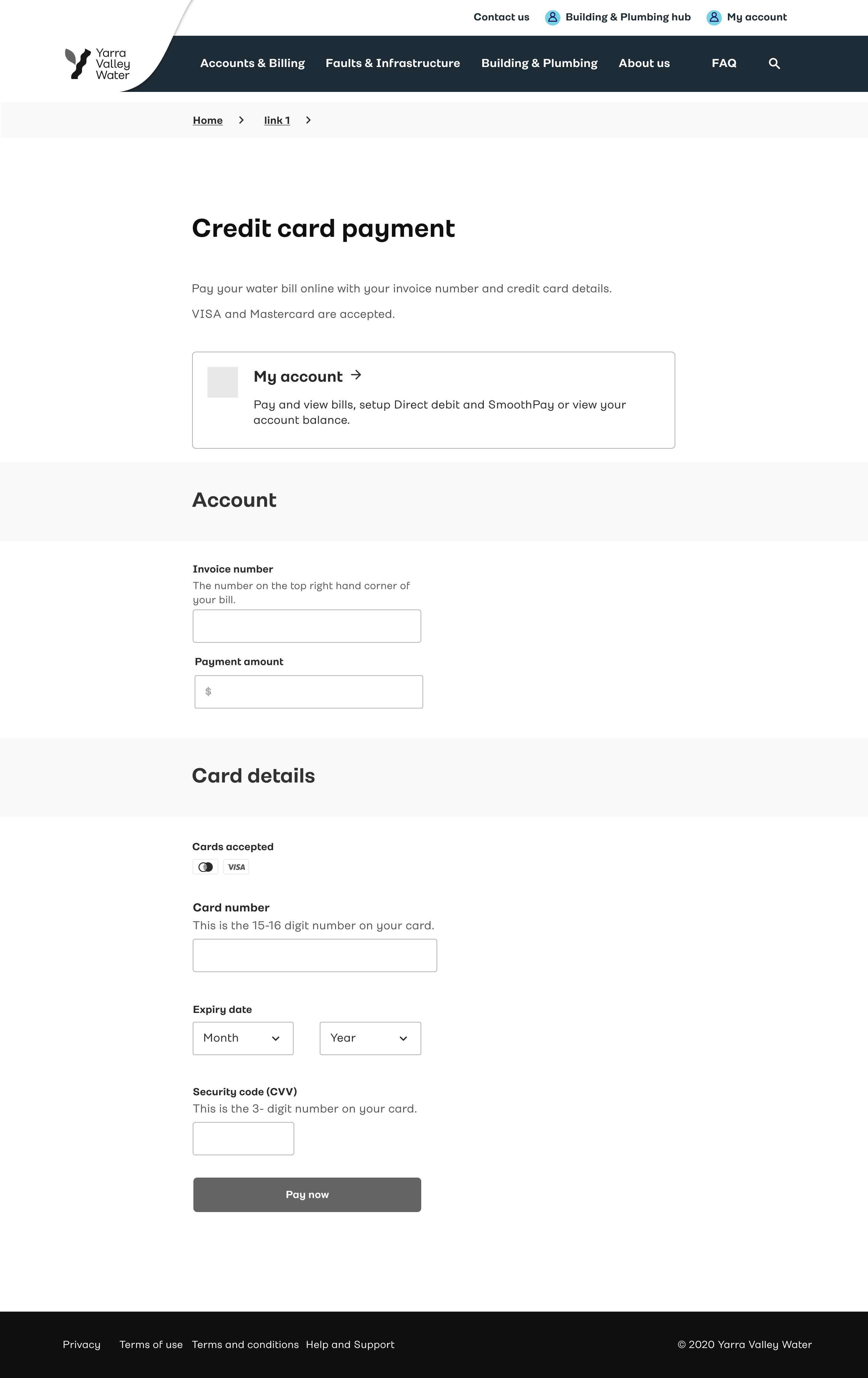
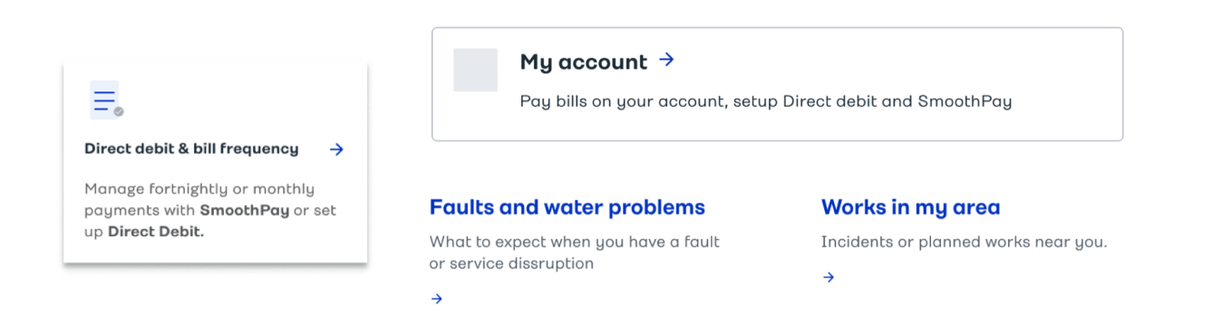
3 Participant said they prefer to make a payment in a portal in a logged in state.
They prefer to have their payment information pre populated, card details saved and assurance they are paying into the correct account.
1 said they would log in and set up Direct Debit
4 participants used the Quick link from the home page to Pay a Bill
2 went straight to the section menu and located easily, there they considered either credit card payment or Pay Direct debit options. Both went to credit card payment.
1 navigated to Direct debit from the Credit card payment page, – then to My account page from the page link. She then was also able to locate the link in the Section Menu
1 Navigated directly to MyAccount to set up Direct debit there
4 Navigated via the Section Menu – then to My account page from the page link.
Generally, people stated that they Direct Debit was common language to them and understood what that meant. People were not familiar with SmoothPay and a little confused about the relationship.
Further messaging has been added to the page to communicate the uses of each.
Generally, people liked the option to add a photo
Were happy to provide contact mobile and/or email
Were curious around how we would label the nature of the fault - (options not available - worth testing)
Found the overall form simple and easy to use.
Half the participants used Quick links the rest used the section Menu
2 said they would just call without checking the Faults Map
1 Found the faults map in the section Menu
3 Found the faults Map from the Report a fault page link
4 of the 6 participants were easily able to locate it in the Global navigation header.
2 people expected to find links to contact us – in ‘About us’ and in the footer.
Once there some participants were not totally clear on which number to call, there may
be a need to further highlight the Account and general enquiries number over Report a fault
and the Plumbing and building HUB.
Generally self-service options were deemed to be useful on this page, links to self-service
portals alternative, the enquiries form and contact email address.
The plumber also highlighted the need for and email address to contact as he need to get
information in writing and like to maintain a conversation thread via email for his own records.
There were no issues with people locating the search icon in the global navigation
Feedback on the design was positive, people commented that they liked the frequently searched items list.
People’s expectations that they would find a list of relevant pages by a key word search were consistent and in line with the expected functionality of the feature.
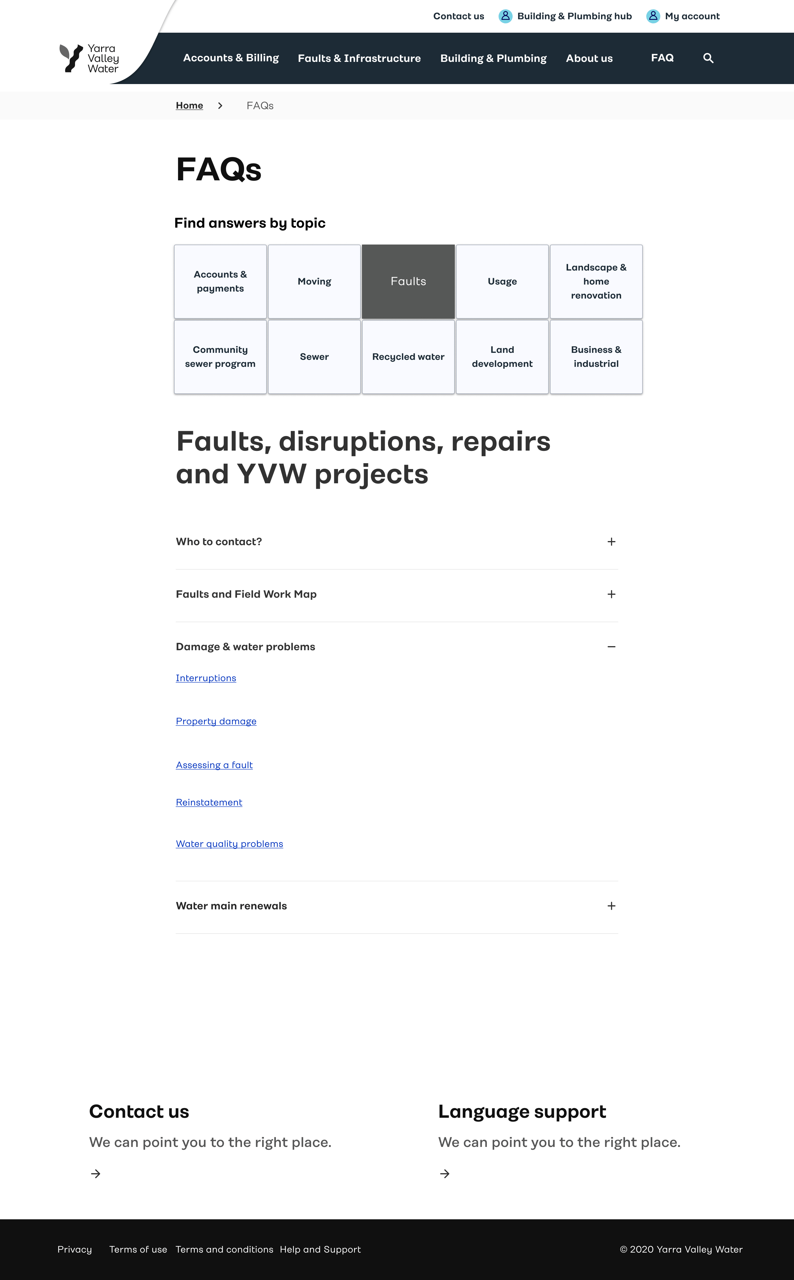
FAQ (Property damage path tested)
4 People navigated to the FAQ section Via links in related content
3 where able to easily locate further information there and complete the task.
1 landed on the FAQ page and jumped back out without investigating at the page, she said it did not look like what she was looking for.
1 person relied heavily on FAQ to locate information, navigating there via a link in the ‘Faults and infrastructure’ main menu under Faults as she said, ‘I assume to find stuff under FAQ’.
She then proceeded to look there directly from the top Nav link when looking for PIC information
Making a 2 people who looked under FAQ for PIC information.
3 people said they would only go to FAQ as a last resort but once there easily found the information they were seeking.
Feedback on the FAQs was generally positive, people were not phased that the content was not consistently formatted as
questions and answers (in some instances links to relevant content pages) and were happy to locate the information they needed.
1 person raised this as an issue (a content writer in our pilot session) and suggested it not be named Frequently Asked Questions
if this format is not strictly followed.
There is a strong link in people between FAQ, search and contact us - enforcing the need for links to Contact us and further customer support at the bottom of pages in the FAQ section as a resort for people who can still not find information they need or require further assistance.
Also, the issue was raised by 3 participants, that a laymen’s guide in the FAQ or somewhere on the site would be useful
to help the ‘Dreamers’ understand processes they need to go through, lime lines for approvals, costs of applications,
what to ask a builder or plumber and what they should and should not be paying for.
People foreign to a topic will not be familiar with language and terms to know what to ask or what to search for.
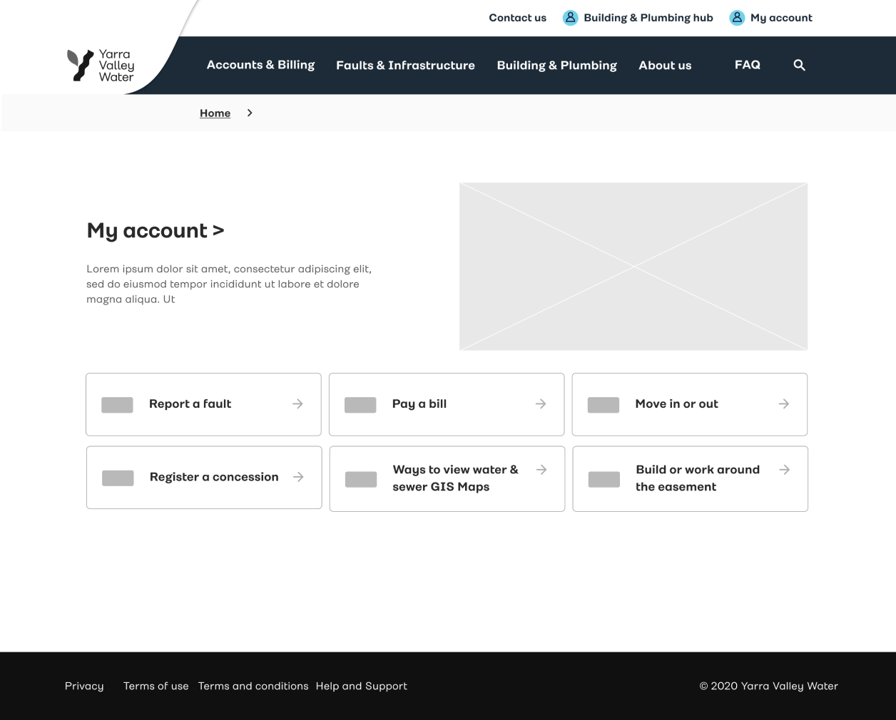
An example of prototype
Scenario
You want to pay your water bill.
Go to the Yarra Vally Water website to find the easiest way to do this and complete your payment.
Task & completion
Pay a Bill
Complete a bill payment using the ‘Credit card payment’ page.
Comments
4 participants used the Quick link from the home page to Pay a Bill
2 went straight to the section menu and located easily, there they considered either credit card payment or Pay Direct debit options. Both went to credit card payment.